Hat Collection
How can a small hat store based in Denver become a stand out brand across the country? After speaking with Hat Collection, I learned the company wanted to expand their brand to include an e-commerce store. I took on the challenge of building a spec e-commerce feature for their site.

Scope
Applications
Two week sprint
-
Sketch
-
InVision
-
Trello
-
Photoshop
The Challenge
-
Discover what hat shoppers are looking for in an online shopping experience.
-
Define the target audience for the brand.
-
Prototype low to mid-fidelity user flows to show site information architecture.
-
Design a high fidelity mock-up of unique pages.
-
Package project and create a style guide for developers with Zeplin.
Who is Hat Collection?
Hat Collection is a small hat store located in the central Denver shopping center. Most of their existing customer base is from foot traffic, driven by their location. Their products cover a wide array from national sport leagues teams, common apparel brands, to moderately priced fashion hats. Their products also include specialty/comical hats (ie. magician hats, furry hats, ect.).

What they need for an e-commerce site
After a series of interviews with both customers who shop online for hats and those who felt more comfortable in a traditional brick and mortar store, I walked away with a few key insights:
-
Ease of browsing was a huge factor (users wanted to browse a large selection of hats similar to how they would in a physical store.)
-
The sports team was more important than the brand that designed the hat.
-
People looking for team hats would like a variety of options for a single team.
-
Customers who were interested in more expensive fashionable hats felt that it was necessary to try them on first. This was a common trend with my interviewees, however the majority of them also admitted that they had bought hats online after they had previously tried them on.

I also talked with the store employees to gain better insight into their customers. I learned that most of the customers were young (16-25) and that most of their sales were sport team hats—predominantly Colorado teams.
"We definitely sell Rockies, Broncos and Nuggets hats more than anything else."
What goes where?
One of the most challenging aspects of my design was the information architecture. The site would have to be easily browsable with a wide variety of categories especially because of the amount of sports teams and sport league products.
I needed to analyze the inventory of the store to see if there would be any insights. I decided to do an open card sort with a number of unique hats to better understand how people mentally compartmentalize the different hat styles and team relations.
This meant taking each different hat style and teams from the store and putting it on a card, presenting someone with the different cards, asking them to sort the products into categories that made sense to them, and lastly naming the category. I used Trello to perform this task.

I quickly saw a trend that sports teams had to be separated by their league and that branded hats should be grouped together.
Outliers


Hat collection carried a few hats that weren't as obviously related to one another. There was a slight correlation between many of them, but the naming conventions used were not consistent. Two of the card sorters noticed a trend of nicer or fashionable hats and funny or comical hats, so I decided to maintain those categories throughout my design.
Defining the user.


What to design and how should it flow?
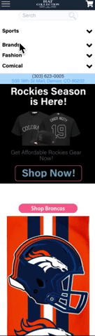
My highest priority was how I was going to design the navigation and header. I wanted to highlight the address and phone number of the store because that was the only information that existed on their current website.

I designed a header that featured the phone number, address, a search field, and the cart. Below the header was the main navigation that was separated into the four umbrella categories: sports, brands, fashion and comical.

A hover activation or tap on mobile would drop down a second tier which would reveal subcategories. Because the sports section was so large, a third-tier would appear with each league's teams below. This would allow a quick filtration for sports fans to find their team and start browsing products.

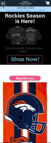
Home Page
My next task was to build out the home page to make it easy to navigate and to highlight the product categories customers were most likely shopping for. It was imperative to allow for ease of browsing but also help users like Taylor find a particular product. After a few iterations, I came up with a design.
A hero banner promotion that would change with the season
Small collections of featured products to allow for browsing the inventory on the home page.

Colorado Broncos, Rockies, and Nuggets team sections
This design allowed for ease of browsing while allowing customers to quickly find a particular product in the inventory.

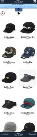
Product Catagories page

Once a user picked a category they would be directed to the product categories page. One of my user personas was looking for a very specific hat; this page still needed more filtration, so on the left-hand side I designed a filter to help users quickly narrow down their search field.

Product page
Once a user selected a product they were taken to a product page. I knew I wanted to include related products for those shoppers who were browsing or those who could be up-sold.


User Testing
I designed out two full user flows and created a prototype using InVision to begin user testing, giving the users two tests to complete:
-
Find and purchase a Broncos hat
-
Find an purchase a Pink Fedora
After a few iterations, I landed on a prototype that proved to be an effective design for the intended user flow. Try out the prototype by clicking the logo below.
Increasing the fidelity
The next step in my workflow was to increase the fidelity of a few unique screens that would show the style of the site along with creating a mobile version at high fidelity.
Home page


Mobile drop down
I wanted to show how the mobile dropdown would look because there were so many subcategories. My solution was a two-tier dropdown that would allow shoppers to easily browse the extensive inventory of the shop.
Product categories
I made a few aesthetic changes when I brought the fidelity up on the product pages. I also put a lot of thought into how on mobile I could hide the filter but still keep its functionality.

Check out page
It was necessary that the check out pages looked trustworthy. Check out pages have to look familiar so that customers feel that the web site is reliable and safe.


Retro
This design was heavily influenced by the input I received from frequent hat shoppers. These people frequent similar sites and have firsthand experience with the challenges of shopping for hats.
The next phase of this project would be to continue:
-
Increasing the fidelity of each of the screens and building out prototyped user flows for each of my personas.
-
Building out the filter feature and doing more user testing.