Bumble BFF App Redesign
In 2014 bumble revolutionized the dating industry by making it not only necessary but acceptable for women to make the first move—shaking up outdated gender norms. In 2016 bumble went on to tackle the friend matching process, but finding a friend has its own set of unique challenges.
Currently, their friend-finding app is a near clone of their dating app. We saw the opportunity to evaluate its current effectiveness. Our goal was to lessen the awkward challenges associated with making new friends.

Is looking at a picture someone enough information to decide if they could be your friend? Currently, this is how bumble displays other users forcing users to swipe on other profiles based on a hero photo, their age, name, where they went to school, and what they do for a living.

The Team:
Scope
Applications
-
Emily O’Ryan
-
PJ Valenzuela
2 weeks
Sketch
InVision
Trello
Photoshop
Our Challange:
-
Define the difference between finding a friend and finding a romantic partner.
-
Minimize the stressful aspect of pursuing a friendship.
-
Maintain brand image.
My Role:
-
Created surveys
-
Synthesized data to see trends.
-
Developed user flows and personas.
-
Lead designer working in Sketch to bring wireframes from low to high fidelity
-
Animated the prototype to include interaction design
Research:
For our research, we sent out 3 questions to active users on the app to get a better sense of the users.
-
How successful have you been finding friends on bumble bff?
-
What is one feature you like on bumble bff and why?
-
If you could change one feature about bumble bff what would it be in why?
Research:
For the first part of our research, we sent out 3 questions to active users on the app to get a better sense of the bumble audience:
-
How successful have you been finding friends on bumble bff?
-
What is one feature you like on bumble bff and why?
-
If you could change one feature about bumble bff what would it be in why?


From our user responses, we learned that most users had not met up with anyone in person and at most, they had only met up with two people. Users felt awkward starting a conversation with users of the same gender. However, users really enjoyed the presentation of the app.
Through social media and interviews, we asked questions that focused on the natural process of making new friends.


From our social media responses, we gathered that most people make friends doing what they love to do. We also gathered that people are looking for others that are interested in the same activities.
Based on our research we developed two personas:
Sara
Sara was a new mother she represented the surprisingly high number of new mothers that popped up in our research. She represents a type of user that is beginning a new chapter in her life and is looking for people whom she can relate to.
"It would be nice to have a mom section to find other mothers. It's hard finding other mom friends"

Joshua

Joshua represented the user type that we assumed we would find, a young professional who just moved to a new to a city looking for new friends and places to go.
"Groups with shared interests makes a conversation easy and gives an excuse to follow up."
Bumble Demographics

Going into this concept project we all expected the majority of users to be in their early 20s but were very surprised to find that the average user is in their 30's. This drastically changed our design because we interpreted that bumble users had a busier lifestyle and needed the app to be simple and quick.
The fact that it was nearly a 50/50 split between single users and married/relationship users meant that we had to cater equally to two very different user personas.
Discovery
"Group interactions mean friends. Initial one on one interaction (means) romance"
In our interview process, we began to notice a trend that people enjoy going to activities that align with their interests. This influenced my decision to design...
Pivoting to event cards was the defining moment of our project because it took the focus off of individuals and onto what we found brought people together—activities.


Minimum Viable Product:

To help us decide what features were needed to make our MVP our team got together to prioritize potential application features and sorted them into 3 categories;
Should have
Could have
Won't have
What bumblebffevents NEEDS to do
-
Create a profile (add pictures and choose interests)
-
Create new events (add pictures and invite others)
-
Find events to attend (with similar interests)
-
Chat with event attendees
-
Maintain bumble branding and interaction patterns (swiping for events)
What is an event and where does it come from?
First, we wanted to alter the onboarding process by focusing more on the user's interests. This would allow events with similar interests to rate higher in the user's feed.
Based on the number of people that referenced meetup.com during the interviews we decided that our "events" would be user-generated just as they are for their "meetups."
The event creating process would present the hardest design challenges I had. How would a user create an event? I needed to decide what must be included in the event creating process along with the overall application aesthetic. Therefore we conducted a design studio to figure out a user flow and what it would look like visually.

We liked the idea of interests being symbols that the user would click to select their intrests however we discarded the idea of a list to show the collection of interests the user selected.

The far left sketch highlighted a classic form design that partially carried over to the final iteration.

We limited adding a photo, name, date, and location to a single page
Design Iterations
This was the first Lo-fi version of how I envisioned creating an event. To make the flow smoother we divided the inputs on to multiple pages to avoid scrolling for the user.
We also wanted to prioritize the interests section and address the padding between input fields.

Final Iteration of Creating an event
Profile page

Based on user testing we decided the event creation process would begin the profile page
Event splash page

We allowed the option to repeat events to speed up user flows for power users.
Intrest page

To allow users to be targeted it was essential that the events would have the same category tags that creating a profile has
Event Input page

We arrived at this design by fallowing similar design patterns that we believed to be heuristically simple.
Adding stock photos


Our research suggested some of our users would be in a rush when using the app so we added a stock photo feature to make the experience go quicker. Only relevant photos from the interest tags already filled out in the process would appear.
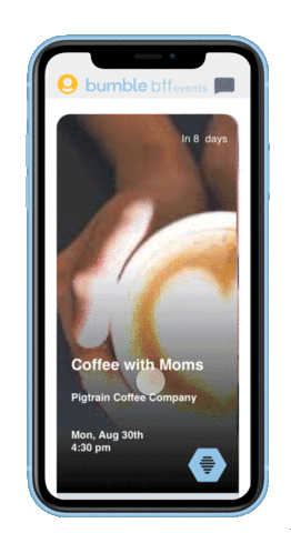
Event Cards
Hi-fi event card

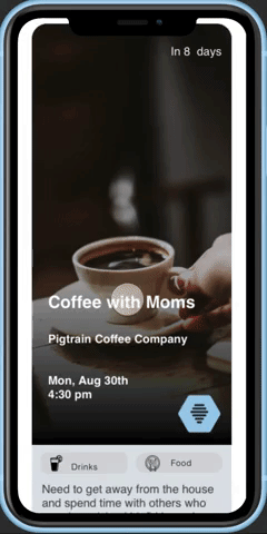
Wire Frame of event card
Event Cards were designed with a similar aesthetic to existing profile cards on bumble. With the necessary information for each event with the photo, name, date, and location prioritized.
We put our design to the test
To test our product we gave users of the current bumble app along with nonusers our prototype and gave them 3 tasks:
Task 1:
Create a profile.
Task 2:
Find a hiking event, sign up, and chat with to others in the event.
Task 3:
Create an event for moms who want to get together over coffee.
We chose theses user flows because our research showed theses would be the most common flow paths for our users. Here is some of the feedback that we received...
Task 1:
“Pop-ups versus background are hard to see.”
“Need confirmation that I made a profile.”
“I have to guess that I made a profile.”
“I don’t think I would remember the question once I started typing.”
Task 2:
All three users once prompted, swiped on the events.
All users knew that swiping to the left meant no, right meant yes.
Task 3:
“I expect it to be a header item.” “I feel like to do this would belong in the profile icon.”
“I like the way the form looks but where did the categories go?”
“Need confirmation that I made a profile.”
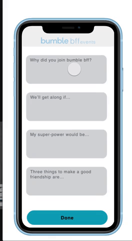
To solve the lack of feedback after onbording we created a profile completion page.


All three users once prompted, swiped on the events but did not know how to initially.
“I don’t think I would remember the question once I started typing.”
We improved the form by designing a pop up for each question that the user would be filling out.
"Definitely an app I would use!"
After a few other UI iterations, we developed our final prototype. This was an incredible project and I had the opportunity to work with a great team.
Next steps
- Define our chat feature further.
- Continue altering the UI to increase usability and pixel perfect ascetics.
- More usability testing and further prototyping of the chat feature to allow for direct messages
- Develop how users could look at other user profiles
- Create an event